Quantcast
Channel: TMS Software
Viewing all 1006 articles
Browse latest View live

Introducing TMS FNC UI Pack

$
0
0

TMS FNC UI Controls, a set of framework neutral controls

Introduction

As your customers use an ever increasing number of devices & operating systems, it is a daily challenge for us, software developers to make our software available for the myriad of target platforms in use. Fortunately, as Pascal developers, we already have a huge benefit that Delphi meanwhile targets 4 platforms: Windows, Mac OSX, iOS and Android. Add Lazarus to that, and Pascal developers can also target Linux and its derivatives such as Raspbian and many more. The 3 main frameworks we have available to create our software for these platforms are: VCL, FMX and LCL. The framework to use will be determined by the target and the IDE used. That implies that the controls that can be used are also typically determined by this choice and might limit your abilities when some controls or control features are not available for one of these frameworks. Addressing that limitation is exactly one of the primary goals of the TMS FNC UI Controls. It offers you a set of powerful & feature-rich UI controls that you can use in Delphi's VCL framework, FMX framework and Lazarus LCL framework. It allows to create Win32, Win64, Mac OS-X, iOS, Android, Linux, Raspbian, ... applications with a single codebase and a single learning curve.

Concept

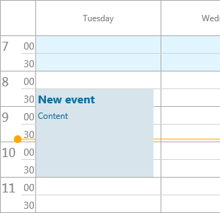
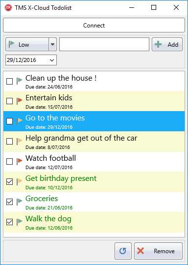
FNC controls enable you to write and use 100% identical Pascal code, be it in a VCL app, FMX app or LCL app. The FNC components methods, properties and events are therefore 100% identical regardless of the framework being used. As an example, the following code creates a new event in our FNC Planner control:

var
  plIt: TTMSFNCPlannerItem;
begin
  plIt := TMSFNCPlanner1.Items.Add;
  plIt.StartTime := Date + EncodeTime(8,30,0,0);
  plIt.EndTime := Date + EncodeTime(11,0,0,0);
  plIt.Title := 'New event';
  plIt.Text := 'Content';
end;
and from this code, it is impossible to tell whether it will be from a VCL, FMX or LCL app. In the application UI, it will also look exactly the same regardless of framework or operating system:


This means that if you properly separate your logic or adopt an MVC approach, you can easily share .PAS files between VCL and FMX projects, between VCL and LCL projects etc... There are in this respect actually only two limitations. First limitation is the design-time form fileformat that is different between VCL, FMX and LCL. VCL uses the .dfm file, FMX uses the .fmx file and LCL uses the .lfm file. For applications for different devices with different form factors, it typically already requires to design the form separately for separate frameworks, so this isn't too much of a limitation. For other applications, a solution is to create the controls at runtime. A second limitation is the namespaces (unit names). To be able to register identical classnames for different framework controls in Delphi, it is required that these live in different namespaces. As such, the FNC VCL controls unit names have the prefix VCL., the FNC FMX controls unit names have the prefix FMX. and the FNC LCL controls use prefix LCL (without dot, to be able to support FPC versions older than v3.0)

In practice, this means that for the example above with the TMSFNCPlanner, the unit clauses for the different frameworks would be as below. To keep using a single source file, a solution is to set a define at project level depending on the framework and write:

uses 
{$IFDEF VCL}
  VCL.TMSFNCPlannerBase, VCL.TMSFNCPlannerData, VCL.TMSFNCPlanner, VCL.TMSFNCCustomControl;
{$ENDIF}

{$IFDEF FMX}
  FMX.TMSFNCPlannerBase, FMX.TMSFNCPlannerData, FMX.TMSFNCPlanner, FMX.TMSFNCCustomControl;
{$ENDIF}

{$IFDEF LCL}
 LCLTMSFNCPlannerBase,  LCLTMSFNCPlannerData, LCLTMSFNCPlanner, LCLTMSFNCCustomControl;    
{$ENDIF}
In the same way, when used, we could include the resource of our form file that is different in each framework via a conditional define:

{$IFDEF VCL}
{$R *.dfm}
{$ENDIF}

{$IFDEF FMX}
{$R *.fmx}
{$ENDIF}

{$IFDEF LCL}
{$R *.lfm}
{$ENDIF}
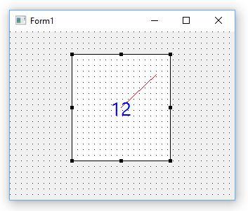
These are of course the things you need to take in account when you want to create a single codebase to build projects with multiple frameworks. In other cases, you do not need to take care of this and you can enjoy the exact same feature set of this UI component library irrespective of the IDE and platform you target.

Another important core concept is the introduction of the TMS FNC Graphics library that is included. This enables you to write graphics code that is framework independent. This includes framework neutral colors, fill, stroke, alignment, font, path types and the TTMSFNCGraphics class using this to draw everything you need. This is a sample code snippet of framework neutral drawing:

var
  gr: TTMSFNCGraphics;
begin
  gr := TTMSFNCGraphics.Create(PaintBox1.Canvas);

  gr.Fill.Color := gcYellow;
  gr.Stroke.Color := gcGray;

  gr.DrawRectangle(0,0,100,20);

  gr.Font.Color := gcRed;
  gr.DrawText(2,0,100,20,'Hello world',false)
  gr.Free;
end;
The result is:


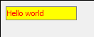
and is exactly the same on every framework, target, device, ...

Controls

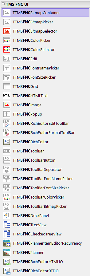
In TMS FNC UI Pack v1.0, there are already 29 controls included. On the tool palette this looks like:

VCL, FMX


LCL


This includes a grid, planner, richeditor, treeview, various color, font, fontsize, bitmap ... picker , toolbar, ... and more.

Introducing the TMS FNC Grid

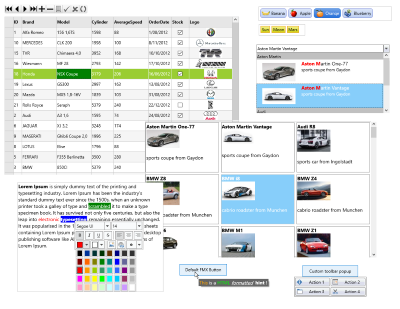
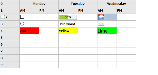
The TMS FNC Grid is a high-performance, not data-bound grid capable of dealing with hundreds of thousands of rows, has a wide range of cell types and inplace editors, offers built-in sorting, filtering and grouping and can import and export data in several file formats. To illustrate some of the capabilities of the TMS FNC Grid, here is some framework code initializing the grid to show several cell capability features:

begin
  TMSFNCGrid1.FixedRows := 2;
  TMSFNCGrid1.ColumnCount := 7;
  TMSFNCGrid1.MergeCells(1,0,2,1);
  TMSFNCGrid1.MergeCells(3,0,2,1);
  TMSFNCGrid1.MergeCells(5,0,2,1);

  TMSFNCGrid1.Cells[1,0] := 'Monday';
  TMSFNCGrid1.HorzAlignments[1,0] := gtaCenter;
  TMSFNCGrid1.Cells[1,1] := 'AM';
  TMSFNCGrid1.Cells[2,1] := 'PM';

  TMSFNCGrid1.Cells[3,0] := 'Tuesday';
  TMSFNCGrid1.HorzAlignments[3,0] := gtaCenter;
  TMSFNCGrid1.Cells[3,1] := 'AM';
  TMSFNCGrid1.Cells[4,1] := 'PM';

  TMSFNCGrid1.Cells[5,0] := 'Wednesday';
  TMSFNCGrid1.HorzAlignments[5,0] := gtaCenter;
  TMSFNCGrid1.Cells[5,1] := 'AM';
  TMSFNCGrid1.Cells[6,1] := 'PM';
  TMSFNCGrid1.AutoNumberCol(0);

  TMSFNCGrid1.AddCheckBox(1,2,false);
  TMSFNCGrid1.AddRadioButton(1,3,1);

  TMSFNCGrid1.AddProgressBar(3,2,50);
  TMSFNCGrid1.Cells[3,3] := 'Hello world';

  TMSFNCGrid1.AddBitmapFile(5,2,'e:	mscalendar.png');
  TMSFNCGrid1.AddBitmapFile(5,3,'e:	msmail.png');

  TMSFNCGrid1.Cells[1,4] := 'Red';
  TMSFNCGrid1.Colors[1,4] := gcRed;
  TMSFNCGrid1.Cells[3,4] := 'Yellow';
  TMSFNCGrid1.Colors[3,4] := gcYellow;
  TMSFNCGrid1.Cells[5,4] := 'Lime';
  TMSFNCGrid1.Colors[5,4] := gcLime;

  TMSFNCGrid1.FontNames[1,4] := 'Courier New';
  TMSFNCGrid1.FontStyles[3,4] := [fsBold];
  TMSFNCGrid1.FontSizes[5,4] := 12;

  TMSFNCGrid1.AddNode(2,2);
end;


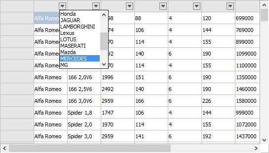
As another quick introduction to the grid, this 2 line snippet demonstrates how data from a CSV file can be loaded and automatic filtering via a drop down in the column header is enabled:

  TMSFNCGrid1.LoadFromCSV('e:	mscars.csv');
  TMSFNCGrid1.Options.Filtering.DropDown := true;

Of course, this is just a very brief introduction to the TMS FNC Grid. Just the FNC grid alone could deserve multiple articles to cover it in detail. You can familiarize yourself with the TMS FNC Grid by reading the full PDF developers guide you can find at http://www.tmssoftware.biz/download/manuals/TMSFNCGridDevGuide.pdf or use the trial or full version of the component that comes with several samples.

Introducing the TMS FNC Planner


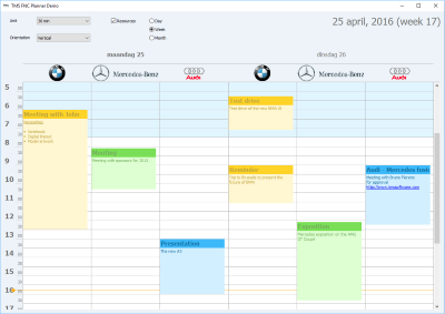
Our TMS FNC Planner is a scheduling component with various built-in time-axis options, i.e. a day, week, month, period, half-day period, timeline as well as custom time-axis mode where you can fully control the duration of each timeslot in the Planner. The Planner supports single and multi resource views and can have the time-axis horizontal or vertical. When targetting the Planner to a mobile device, it will automatically use a touch-friendly approach to select, insert, delete, pan in the Planner. In a previous blog, we have presented a fully framework neutral sample TVGuide application that uses our TMS FNC Planner in this blog article: http://www.tmssoftware.com/site/blog.asp?post=335

Introducing the TMS FNC RichEditor

With the TMS FNC Rich Editor you can assemble a WordPad-style editor or Outlook style mail application in a matter of minutes. TMS FNC Rich Editor comes with capabilities to do WYSIWYG editing of rich text with images, URLs, bullet lists, custom graphics, mail merging etc... To make development even faster, there is a pre-built toolbar for rich editor editing and formatting and non-visual components to facilitate the import and export from HTML & RTF files and that of course in all frameworks, operating systems and target devices supported.

In this introduction sample, drop the TTMSFNCRichEditor on the form as well as the TTMSFNCRichEditorFormatToolbar and assign the TTMSFNCRichEditor to TTMSFNCRichEditorFormatToolbar.RichEditor. Also add a TTMSFNCRichEditorHTMLIO and TTMSFNCRichEditorRTFIO non-visual component on the form and also assign the TTMSFNCRichEditor to TTMSFNCRichEditorHTMLIO.RichEditor and TTMSFNCRichEditorRTFIO.RichEditor.

The rich editor content can be initialized with following code to perform a mail-merge that uses here two merge fields : NAME and EMAIL.

begin
  TMSFNCRichEditor1.AddText('Dear Mr. NAME');
  TMSFNCRichEditor1.AddLineBreak;
  TMSFNCRichEditor1.AddText('CC: EMAIL');
  TMSFNCRichEditor1.SelStart := 9;
  TMSFNCRichEditor1.SelLength := 4;
  TMSFNCRichEditor1.SetSelectionMergeField('NAME');

  TMSFNCRichEditor1.SelStart := 21;
  TMSFNCRichEditor1.SelLength := 5;
  TMSFNCRichEditor1.SetSelectionMergeField('EMAIL');
end;
When the app is started, the text can be further decorated by editing & formatting via the toolbar. When it is ready, following code performs the merge with the NAME and EMAIL field and is exported to RTF via TTMSFNCRichEditorRTFIO and after this, the merge is undone:
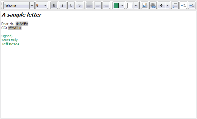

var
  sl: TStringList;
begin
  sl := TStringList.Create;

  try
    sl.Add('NAME=Elon Musk');
    sl.Add('EMAIL=elon@tesla.com');
    TMSFNCRichEditor1.Merge(sl);
  finally
    sl.Free;
  end;

  TMSFNCRichEditorRTFIO1.Save('e:	msmerge.rtf');

  TMSFNCRichEditor1.UnMerge;
end;

Introducing the TMS FNC TreeView

Finally, another large feature-packed control from the TMS FNC UI Controls set we want to introduce is the TMS FNC TreeView, TTMSFNCTreeView. This is a multi-column treeview control with regular mode and virtual mode and designed for and capable of using millions of nodes. In addition, the nodes support rich information, text atttributes can be customized per node cell, HTML formatted text in node cells is possible, images, checkboxes can be added and optional inplace editing is available.

In this introduction we'd like to demonstrate the difference in regular (node collection) based mode and virtual mode when using the TTMSFNCTreeView. The first code snippet demonstrates an initialization of a 2 column treeview:

var
  tn,cn: TTMSFNCTreeViewNode;
begin
  TMSFNCTreeView1.BeginUpdate;

  TMSFNCTreeView1.Columns.Clear;
  TMSFNCTreeView1.Nodes.Clear;

  TMSFNCTreeView1.Columns.Add.Text := 'Country';
  TMSFNCTreeView1.Columns.Add.Text := 'Capital';

  tn := TMSFNCTreeView1.AddNode(nil);
  tn.Text[0] := 'Europe';

  cn := TMSFNCTreeView1.AddNode(tn);
  cn.Text[0] := 'Germany';
  cn.Text[1] := 'Berlin';

  cn := TMSFNCTreeView1.AddNode(tn);
  cn.Text[0] := 'France';
  cn.Text[1] := 'Paris';

  cn := TMSFNCTreeView1.AddNode(tn);
  cn.Text[0] := 'United Kingdom';
  cn.Text[1] := 'London';

  tn := TMSFNCTreeView1.AddNode(nil);
  tn.Text[0] := 'Asia';

  cn := TMSFNCTreeView1.AddNode(tn);
  cn.Text[0] := 'Japan';
  cn.Text[1] := 'Tokyo';

  cn := TMSFNCTreeView1.AddNode(tn);
  cn.Text[0] := 'China';
  cn.Text[1] := 'Peking';

  TMSFNCTreeView1.EndUpdate;
end;


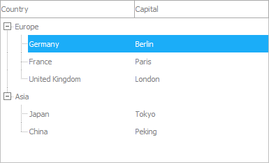
Important to note here is that the text in the multiple columns of the treeview can be simply accessed with an array indexed Node.Text[]: string property.

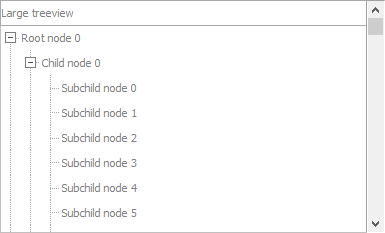
In a next step, we'll use the TTMSFNCTreeView in virtual mode and insert 1 million nodes! Columns are not virtual, so this must be initialized and to keep it simple, this will be initialized to one column:

begin
  TMSFNCTreeView1.Columns.Clear;
  TMSFNCTreeView1.Columns.Add;
  TMSFNCTreeView1.Columns[0].Text := 'Large treeview';
end;

To use the TTMSFNCTreeView in virtual mode, two events are crucial: the OnGetNumberOfNodes() event and the OnGetNodeText() event. The first is triggered to know how many nodes at root level or child level should be added. The latter is used to retrieve the column text of the node. Let's start with the OnGetNumberOfNodes event. This event has parameters ANode and a var parameter ANumberOfNodes. ANode is either a node with ANode.Level set to -1 indicating the number of root level nodes is requested or it contains the node for which the number of child nodes is requested. With the ANode.Level property, you can know how many hierarchical levels deep the node is. In this example, we'll insert 1 million (100x100x100) nodes by inserting 100 root level nodes that have each 100 childs and each child has again 100 subchilds.

This event takes care of this:

procedure TForm1.TMSFNCTreeView1GetNumberOfNodes(Sender: TObject;
  ANode: TTMSFNCTreeViewVirtualNode; var ANumberOfNodes: Integer);
begin
    if ANode.Level = -1 then
    ANumberOfNodes := 100
  else  
  if ANode.Level = 0 then
    ANumberOfNodes := 100
  else  
  if ANode.Level = 1 then
    ANumberOfNodes := 100;
end;

Then, the other event for virtual node handling, OnGetNodeText is used to return the text for node columns. Note that this event will be triggered for each node and for each column for this node. The column for which the event is triggered is indicated with the AColumn parameter. As we have only 1 column in this example, this is ignored and the node text is directly returned:

procedure TForm1.TMSFNCTreeView1GetNodeText(Sender: TObject;
  ANode: TTMSFNCTreeViewVirtualNode; AColumn: Integer;
  AMode: TTMSFNCTreeViewNodeTextMode; var AText: string);
begin
  if ANode.Level = 0 then
    AText := 'Root node '+inttostr(ANode.Index)
  else
  if ANode.Level = 1 then
    AText := 'Child node '+inttostr(ANode.Index)
  else
  if ANode.Level = 2 then
    AText := 'Subchild node '+inttostr(ANode.Index);
end;


We hope this brief introduction of the major controls in the TMS FNC UI Pack whetted your appetite to start exploring the components, discovering the benefits and efficiency of having one UI component set to cover all the target operating systems you want to target and perhaps cook up your first Linux GUI apps with LCL. We're eager to learn how your experience is going and to hear your feedback, comments and further wishes and needs in this direction.


Revisiting persisting app settings in the cloud

$
0
0

Back in 2013, I wrote a blog on persisting application settings in the cloud like Google Chrome for example does. The solution presented at that time was using the DropBox cloud service. The technique was quite simple. Persist settings in an INI file and automatically store and retrieve this INI file from a DropBox account.

Now, 3 years later, I wanted to revisit this technique and present a new solution that is more flexible and fine-grained and can be used from apps on Windows, Mac OSX, iOS, Android and Linux. The new technique will use the TMS structured data cloud storage service myCloudData.net.

As a brief introduction to myCloudData, think of it as configurable tables in the cloud, accessible with a REST API and using OAUTH 2 for authentication & authorization. If you want to learn more about myCloudData.net, check its API doc or another blog article written about it.

Time to get down to the nitty gritties! As an example, a VCL app was created with a left and right aligned panel and inbetween a memo. The user can customize the left panel and right panel width with a splitter control and by right-clicking the panel, the panel color can be changed. Further, there is a checkbox for both panels to toggle the visibility of the panel. This is a typical and basic skeleton of what many user configurable apps could be.


We'll now use the myCloudData.net service to store not only how the user configures this left and right panel, but also the last form's size and position on the screen. Whenever the user restarts the app, it will bring back the app as he originally left it on whatever machine the user starts this app. He will always find it back as he left it.
We'll drop a TAdvmyCloudData component on the form and in the form's constructor, we'll initialize it with the application key & secret obtained to use the myCloudData.net service. Further, this component is initialized to persist its application token & secret and finally, the call to AdvmyCloudData.Connect will test validity of possible existing tokens or will perform a new authentication & authorization when no valid tokens are found.

procedure TmCDDemo.FormCreate(Sender: TObject);
begin
  FConnected := false;
  AdvMyCloudData1.App.Key := MYCLOUDDATAKEY;
  AdvMyCloudData1.App.Secret := MYCLOUDDATASECRET;
  AdvMyCloudData1.App.CallBackPort := 8888;
  AdvMyCloudData1.App.CallBackURL := 'http://127.0.0.1:8888';

  AdvMyCloudData1.PersistTokens.Location := plIniFile;
  AdvMyCloudData1.PersistTokens.Key := '.myCloudData.ini';
  AdvMyCloudData1.PersistTokens.Section := 'tokens';
  AdvMyCloudData1.Connect;
end;
Once this step is performed, the AdvMyCloudData component triggers the OnConnected event from where we call the form's ReadSettings method.

In the ReadSettings method, it is checked whether the table to hold the settings exists for the user account on the service or not. When found, the first record from the table is read to retrieve the settings. When not found, the metadata for the table is created. Of course when the new table is created with its metadata, it's not yet possible to retrieve stored settings. This table will only be used the first time then when the user closes the app.
procedure TmCDDemo.ReadSettings;
var
  table: TMyCloudDataTable;

begin
  table := AdvMyCloudData1.TableByName('SETTINGS');

  if not Assigned(table) then
  begin
    table := AdvMyCloudData1.CreateTable('SETTINGS');
    table.MetaData.Add('PNLVISL', ftBoolean);
    table.MetaData.Add('PNLVISR', ftBoolean);
    table.MetaData.Add('PNLWL', ftInteger);
    table.MetaData.Add('PNLWR', ftInteger);
    table.MetaData.Add('PNLCLRL', ftInteger);
    table.MetaData.Add('PNLCLRR', ftInteger);
    table.MetaData.Add('FORMW', ftInteger);
    table.MetaData.Add('FORMH', ftInteger);
    table.MetaData.Add('FORML', ftInteger);
    table.MetaData.Add('FORMT', ftInteger);
    table.SetMetaData;
  end
  else
  begin
    table.Query;
    if table.Entities.Count > 0 then
    begin
      Self.Left := table.Entities[0].Value['FORML'];
      Self.Top := table.Entities[0].Value['FORMT'];
      Self.Width := table.Entities[0].Value['FORMW'];
      Self.Height := table.Entities[0].Value['FORMH'];
      LeftPanel.Visible := table.Entities[0].Value['PNLVISL'];
      RightPanel.Visible := table.Entities[0].Value['PNLVISR'];
      LeftPanel.Width := table.Entities[0].Value['PNLWL'];
      RightPanel.Width := table.Entities[0].Value['PNLWR'];
      LeftPanel.Color := TColor(table.Entities[0].Value['PNLCLRL']);
      RightPanel.Color := TColor(table.Entities[0].Value['PNLCLRR']);

      LeftCheckBox.Checked := LeftPanel.Visible;
      RightCheckBox.Checked := RightPanel.Visible;
    end;
  end;
end;
It was a choice to create this metadata programmatically. It could as well have been created in advance online via the metadata editor. When checking the myCloudData.net account, after this programmatic creation of metadata, it is shown as:

To store the settings, all we need to do is call WriteSettings from the form's OnClose event. This of course is only done when TAdvmyCloudData was able to succesfully connect to an account on the service:
procedure TmCDDemo.FormClose(Sender: TObject; var Action: TCloseAction);
begin
  if FConnected then
    WriteSettings;
end;
Persisting the settings in the WriteSettings procedure becomes:
procedure TmCDDemo.WriteSettings;
var
  table: TMyCloudDataTable;
  entity: TMyCloudDataEntity;
  ins: boolean;
begin
  table := AdvMyCloudData1.TableByName('SETTINGS');

  table.Query;

  ins := table.Entities.Count = 0;

  if not ins then
    entity := table.Entities[0]
  else
    entity := table.Entities.Add;

  entity.Value['FORML'] := Self.Left;
  entity.Value['FORMT'] := Self.Top;
  entity.Value['FORMW'] := Self.Width;
  entity.Value['FORMH'] := Self.Height;
  entity.Value['PNLVISL'] := LeftPanel.Visible;
  entity.Value['PNLVISR'] := RightPanel.Visible;
  entity.Value['PNLWL'] := LeftPanel.Width;
  entity.Value['PNLCLRL'] := integer(LeftPanel.Color);
  entity.Value['PNLWR'] := RightPanel.Width;
  entity.Value['PNLCLRR'] := integer(RightPanel.Color);

  if not ins then
    entity.Update
  else
    entity.Insert;
end;
So, with this small amount of code and a one-time authentication and authorization of the myCloudData account, the user will always have the last settings of the app he used, on any machine from where he is using the application.
I hope this serves as a small example of uses for the myCloudData.net service and actually only scratches the surface of possibilities. The use of myCloudData.net for the functionality demonstrated here is completely free, as in free beer. Only when using large amounts of data or blob fields, a subscription to myCloudData.net is required.
Our TMS Cloud Pack component TAdvmyCloudData makes it completely abstract and dead-simple to use the underlying REST API from the service for VCL applications and this component is also available with exactly the same interface for FireMonkey applications and Lazarus applications.

We are eager to learn about your creative and innovative applications using these components and service and in what further directions this can be developed to satisfy your needs!

The full source code of this sample application can be downloaded here.

Rest Server Authentication using JWT (JSON Web Token)

$
0
0

When building HTTP Servers with TMS Business frameworks - more specifically Rest/JSON servers with TMS XData - you can use the builtin authentication and authorization mechanism to protect server resources/requests. Such mechanism is actually implemented in our lower-level framework TMS Sparkle and can be used for any types of HTTP server, not only XData. This blog post will show you how to use authorization and authentication using JSON Web Tokens.

JSON Web Token (JWT)

From Wikipedia: "JSON Web Token (JWT) is a JSON-based open standard (RFC 7519) for passing claims between parties in web application environment". That doesn't say much if we have never heard about it before. There is plenty of information out there to read more in details about JWT, so here I'm going directly to the point in a very summarized practical way.

A JWT is a string with this format:

aaaaaaaaaaa.bbbbbbbbbb.cccccccccc

It's just three sections in string separated by dots. Each section is a text encoded using base64-url:

(base64url-encoded header).(base64url-encoded claims).(base64url-encoded signature)

So a real JWT looks like this:

eyJhbGciOiJIUzI1NiIsInR5cCI6IkpXVCJ9.eyJuYW1lIjoidG1zdXNlciIsImlzcyI6IlRNUyBYRGF0YSBTZXJ2ZXIiLCJhZG1pbiI6dHJ1ZX0.
pb-4JAajpYxTsDTqWtgyIgpoqCQH8wlHl4RoTki8kpQ

If we decode each part of the JWT separately (remember, we have three parts separated by dots), this is what we would have from part one (spaces and returns added to make it more readable). It's the header:

{
  "alg":"HS256", 
  "typ":"JWT"
}

And this is part two decoded, which is the payload or claims set:

{
  "name":"tmsuser",
  "iss":"TMS XData Server",
  "admin":true
}

Finally the third part is the signature. It makes no sense to decode it here since it's just a bunch of bytes that represent the hash of three things: the header, the payload, and the secret that only the generator of the JWT knows.

The payload is the JSON object that "matters", it's the actual content that end-user applications will read to perform actions. The header contains meta information of the token, mostly the hashing algorithm used to generate the signature, also present in the token. So, we could say that a JWT is just an alternative way to represent a JSON object, but with a signature attached to it.

What does it has to do with authentication and authorization? Well, you can think of the JWT as a "session" or "context" for an user accessing your server. The JSON object in the payload will contain arbitrary information that you are going to put in there, like permissions, user name, etc. This token will be generated by your server upon some event (for example, an user "login"), and then the client will resend the token to the server whenever he wants to perform any operation. This would be the basic workflow:

1. Client performs "login" in the server by passing regular user credentials (user name and password for example)
2. The server validates the credentials, generates a JWT with relevant info, using the secret, and sends the JWT back to the client
3. The client sends the JWT in next requests, passing the JWT again to the server
4. When processing each request, the server checks if the JWT signature is valid. If it is, then it can trust that the JSON Object in payload is valid and can proceed normally

Since only the server has the secret, there is no way the client can change the payload, adding false information to it - for example, change the user name or permissions. When the server receives the modified JWT, the signature will not match and the token will be rejected by the server.

For more detailed information on JSON Web Tokens (JWT) you can refer to https://jwt.io, the Wikipedia article or just the official specification. It's also worth mentioning that for handling JWT internally, either to create or validate the tokens, TMS XData uses under the hood the open source Delphi JOSE and JWT library.

JWT Authentication with TMS XData

Enough of theory, the next steps will show you how to implement authentication/authorization using JWT in TMS XData. This is just a suggestion of implementation, and it's up to you to define with more details how your system will work. In this example we will create a login service, add the middleware and use XData server-side events to implement authorization.

User Login and JWT Generation

We're going to create a service operation to allow users to perform login. Our service contract will look like this:

  [ServiceContract]
  ILoginService = interface(IInvokable)
  ['{BAD477A2-86EC-45B9-A1B1-C896C58DD5E0}']
    function Login(const UserName, Password: string): string;
  end;

Users will send user name and password, and receive the token. Delphi applications can invoke this method using the TXDataClient, or invoke it using regular HTTP, performing a POST request passing user name and password parameters in the body request in JSON format. Nevertheless, be aware that you should always use a secure connection (HTTPS) in your server to protect such requests.

The implementation of such service operation would be something like this:

uses {...}, Bcl.Jose.Core.JWT, Bcl.Jose.Core.Builder;
 
function TLoginService.Login(const UserName, Password: string): string;
var
  JWT: TJWT;
  Role: string;
  IsAdmin: Boolean;
begin
  { check if UserName and Password are valid, retrieve User data from database, 
   add relevant claims to JWT and return it. In this example, we will only
   add two claims: Role and IsAdmin.  }
  
  // Now that application specific logic is finished, generate the token 
  JWT := TJWT.Create(TJWTClaims);
  try
    JWT.Claims.SetClaimOfType<string>('role', Role);
    JWT.Claims.SetClaimOfType<string>('isadmin', IsAdmin);
    JWT.Claims.Issuer := 'XData Server';
    Result := TJOSE.SHA256CompactToken('secret', JWT);
  finally
    JWT.Free;
  end;
end;

Now, users can simply login to the server by performing a request like this (some headers removed):

POST /loginservice/login HTTP/1.1
content-type: application/json
 
{
  "UserName": "tmsuser",
  "Password": "tmsuser"
}

And the response will be a JSON object containing the JSON Web Token (some headers removed and JWT modified for better readibility):

HTTP/1.1 200 OK
Content-Type: application/json
 
{
    "value": "eyJ0eXAiOiJKV1QiLCJhbGciOiJIUzI1NiJ9.eyJyb2xlcyI6InRtc3VzZXIiLCJpc3MiOiJYRGF0YSBTZXJ2ZXIifQ.CAxxa3aizZheG3VXmBoXtfdg3N5jN9tNAZHEV7R-W4Q"
}

For further requests, clients just need to add that token in the request using the authorization header by indicating it's a bearer token. For example:

GET /customers?$orderby=Name HTTP/1.1
content-type: application/json
authorization: Bearer eyJ0eXAiOiJKV1QiLCJhbGciOiJIUzI1NiJ9.eyJyb2xlcyI6InRtc3VzZXIiLCJpc3MiOiJYRGF0YSBTZXJ2ZXIifQ.CAxxa3aizZheG3VXmBoXtfdg3N5jN9tNAZHEV7R-W4Q

Adding TJwtMiddleware to process tokens in requests

The second step is to add the TJwtMiddleware to our XData server module. It's done just once, before starting up the server with the module. All we need to inform is the secret our middleware will use to validate the signature of the received tokens:

uses {...}, Sparkle.Middleware.Jwt;
 
{...}
  Module.AddMiddleware(TJwtMiddleware.Create('secret'));

That's it. What this will do? It will automatically check for the token in the authorization header. If it does exist and signature is valid, it will create the IUserIdentity interface, set its Claims based on the claims in the JWT, and set such interface to the User property of THttpRequest object. Regardless if the token exists or not and the User property is set or not, the middleware will forward the processing of the request to your server anyway. It's up to you to check if user is present in the request and perform the correct actions. The only situation where the middleware will return immediately is if the token is present and is invalid (bad format or wrong signature). In this case it will return an error to the client immediately and your server code will not be executed.

Authorizing the requests

Finally, in your application code, all you have to do is check for such User property and take actions based on it. For example, suppose you have a service operation DoSomething that runs some arbitrary code. You don't want to allow anonymous requests (not authenticated) to execute that operation. And you will also only execute it if authenticated user is an administrator. This is how you would implement it:

uses {...}, Sparkle.Security, XData.Sys.Exceptions;
 
procedure TMyService.DoSomething;
var
  User: IUserIdentity;
begin
  User := TXDataOperationContext.Current.Request.User;
  if User = nil then
    raise EXDataHttpUnauthorized.Create('User not authenticated');
  if not (User.Claims.Exists('isadmin') and User.Claims['isadmin'].AsBoolean) then
    raise EXDataHttpForbidden.Create('Not enough privileges');
  
  // if code reachs here, user is authenticated and is administrador
  // execute the action
end;

Server-side events

The above code is valid for service operations. But you can also use server-side events to protect the entity sets published by XData. For example, you can use the OnEntityDeleting event to not allow non-admin users to delete resources. The event handler implementation would be pretty much the same as the code above (Module refers to a TXDataServerModule object):

  Module.Events.OnEntityDeleting.Subscribe(procedure(Args: TEntityDeletingArgs)
    var User: IUserIdentity;
    begin
      User := TXDataOperationContext.Current.Request.User;
      if User = nil then
        raise EXDataHttpUnauthorized.Create('User not authenticated');
      if not (User.Claims.Exists('isadmin') and User.Claims['isadmin'].AsBoolean) then
        raise EXDataHttpForbidden.Create('Not enough privileges');
    end
  );

That applies to all entities published by the server. Of course, if you want to restrict the code to some entities, you can check the Args.Entity property to verify the class of object being deleted and perform actions accordingly.

Finally, another nice example for authorization and server-side events. Suppose that every entity in your application has a property named "Protected" which means only admin users can see those entities. You can use a code similar to the one above to refuse requests that try to modify, create or retrieve a protected entity if the requesting user is not admin.

But what about complex queries that return multiple entities? In this case you can use the OnEntityList event, which will provide you with the Aurelius criteria (TCriteria) that will be used to retrieve the entities. You can then modify such criteria depending on user permissions:

  Module.Events.OnEntityList.Subscribe(procedure(Args: TEntityListArgs)
    var 
      User: IUserIdentity;
      IsAdmin: Boolean;
    begin
      User := Args.Handler.Request.User;
      IsAdmin := (User <> nil) and User.Claims.Exists('isadmin') and User.Claims['isadmin'].AsBoolean;
      if not IsAdmin then
        Args.Criteria.Add(TLinq.EqualsTo('Protected', false));
    end
  );

The code above simply checks if the requesting user has elevated privileges. If it does not, then it adds an extra condition to the criteria (whatever the criteria is) which filters only the entities that are not protected. So non-admin users will not see the protected entities in the server response.


For more information about the subject, here is a summary of the links related to the topics covered in this post:
TMS Business Subscription Page
TMS XData Product Page
TMS Sparkle Product Page
TMS XData Online Documentation
TMS Sparkle Online Documentation
JSON Web Token Web Site
Wikipedia article about JSON Web Token
JSON Web Token Specification - RFC-7519
Delphi JOSE and JWT library


Developing your first FNC custom control

$
0
0

Some weeks ago, we released the TMS FNC UI Pack, a set of Framework Neutral Components (FNC), i.e. UI controls that can be used from VCL Windows applications, FireMonkey (FMX) Windows, Mac OS-X, iOS, Android applications and LCL framework based Lazarus applications for Windows, Linux, Mac OS-X,..
The TMS FNC UI Pack contains highly complex & feature-rich components such as grid, planner, rich editor, treeview, toolbars. To create such complex components that work under 3 frameworks and a myriad of operating systems is not a trivial excercise and requires intricate knowledge about the VCL, FMX and LCL frameworks as well as the operating systems the controls need to work under.
To help ourselves and the users of the TMS FNC UI Pack, we have introduced several abstractions that facilitate creating framework neutral components and this is what we want to cover in this brief introduction to developing FNC custom controls.

FNC custom control basics

The structure of the FNC custom control we want to present is this of a classic UI control. The control is responsible for painting itself and interacts with keyboard and/or mouse. The control has several properties to control its appearance and behavior. If we look at this concept from the perspective of implementing this for 3 different frameworks, the biggest challenges faced are:

1) abstractions in the code for dealing with graphics: especially VCL and FMX are quite different in this respect, so abstraction is welcome.
2) abstractions in keyboard and mouse handling: also here there are differences, although subtle, between VCL, FMX and LCL.
3) abstractions in types: types such as font, color, rectangles, points are different in FMX and VCL.

So, we'll cover what is included in FNC to facilitate dealing with this.

Unit organisation

Perhaps the biggest stumbling block is unit organisation. As it is desirable to create components that can be installed in the IDE, (which means for Delphi for both the VCL and FireMonkey framework simultanously) we'll need units for VCL and units for FireMonkey. Although we can use the same class name, the class hierarchy for the VCL control and the FMX control will be different. The VCL FNC control will descend from the VCL TCustomControl and the FMX FNC control will descend from the FMX TControl. In Lazarus, the FNC control will descend from the LCL TCustomControl. In a nutshell, to solve this, we create 3 units for a component that will be nearly identical and we provide a conversion step to allow you to write the code in one unit and automatically generate the other units for the other frameworks. For this example, in total, we'll have 6 units: 3 units with the code for the control for the 3 supported frameworks and 3 units for the component registration in the IDE:

// Units for the VCL variant of the FNC control
VCL.TMSFNCCust.pas
VCL.TMSFNCCustReg.pas

// Units for the FMX variant of the FNC control
FMX.TMSFNCCust.pas
FMX.TMSFNCCustReg.pas

// Units for the LCL variant of the FNC control
LCLTMSFNCCust.pas
LCLTMSFNCCustReg.pas
We'll also use 3 packages: a package for VCL, a package for FMX and a package for LCL. We can install the VCL & FMX package simultanously in the Delphi IDE and the LCL package in the Lazarus IDE. The package for the custom control will have a dependency to the framework plus to the TMS FNC UI Pack for the framework. The structure of the packages in the Delphi 10.1 Berlin IDE is:


and in Lazarus, this is:

Getting to grips

Ok, now that the unit structure is setup, we can focus on writing the code. To write this code, we'll use 3 TMS FNC UI Pack units with abstractions: xxx.TMSFNCCustomControl, xxx.TMSFNCGraphics and xxx.TMSFNCTypes (with xxx = the framework). In this example, we'll write the code in VCL and automatically generate the FMX & LCL equivalents from it, so the uses list becomes:

for FMX
uses
  Classes, Types, FMX.TMSFNCCustomControl, FMX.TMSFNCGraphics, FMX.TMSFNCTypes;
for LCL
uses
  Classes, Types, LCLTMSFNCCustomControl, LCLTMSFNCGraphics, LCLTMSFNCTypes;
The FNC control we'll write here is very rudimentary for the sake of focusing on the abstractions. It is basically a gauge control that can be clicked with the mouse to set the gauge value, has a gauge value property to set it and can use the key up & down to change the gauge value. So, we need painting of the gauge, we need some gauge line color & font settings and we need handling of the mouse click and keyboard.


Control initialization

The control descends from the abstract FNC class TTMSFNCCustomControl and exposes one extra color property for the gauge line color (note that this are of the abstract type TTMSFNCGraphicsColor), a font (of the abstract type TTMSFNCGraphicsFont, that has also a font color in all frameworks) and a gauge value property of the type TControlValue. Note that the Stroke & Fill properties are published. This contains the control border & control background color and even enables things such as setting a background gradient, a border with a specific pen style etc...

  TControlValue = 0..100;

  TTMSFNCCustomControlSample = class(TTMSFNCCustomControl)
  private
    FLineColor: TTMSFNCGraphicsColor;
    FFont: TTMSFNCGraphicsFont;
    FValue: TControlValue;
  protected
    procedure Draw({%H-}AGraphics: TTMSFNCGraphics; {%H-}ARect: TRectF); override;
  public
    constructor Create(AOwner: TComponent); override;
    destructor Destroy; override;
  published
    property Stroke;
    property Fill;
    property Font: TTMSFNCGraphicsFont read FFont write SetFont;
    property LineColor: TTMSFNCGraphicsColor read FLineColor write SetLineColor default gcRed;
    property Value: TControlValue read FValue write SetValue default 0;
  end;
In the constructor, initialization of the line color property value is done as well as the border color and the font is created. This is of the type TTMSFNCGraphicsFont and the main purpose is to have a font with font color in all frameworks. There is one more thing particular in the constructor and that is the assignment of the Font.OnChange event handler. In Delphi Pascal, we can simply assign the object method but for the FPC compiler, this needs to be prefixed with the @ symbol. Fortunately, the Lazarus environment has the LCL define we can use to handle this.

{ TTMSFNCCustomControlSample }

constructor TTMSFNCCustomControlSample.Create(AOwner: TComponent);
begin
  inherited;
  Stroke.Color := gcBlack;
  FLineColor := gcRed;
  FFont := TTMSFNCGraphicsFont.Create;
  FFont.OnChanged := {$IFDEF LCL}@{$ENDIF}FontChanged;
  Width := 100;
  Height := 100; 
end;

destructor TTMSFNCCustomControlSample.Destroy;
begin
  FFont.Free;
  inherited;
end;
Painting

The control descends from the abstract FNC class TTMSFNCCustomControl and exposes 3 color properties, the border, background and gauge line color (note that these are of the type TTMSFNCGraphicsColor), a font (of the type TTMSFNCGraphicsFont, that has also a font color in all frameworks) and a gauge value property of the type TControlValue.

Painting is done in the override of the Draw() method that has 2 parameters: AGraphics: TTMSFNCGraphics, a framework neutral graphics library and the rectangle of the control via ARect of the type TRectF. In VCL and LCL only the not fractional part of the floating point numbers is used but of course in the FireMonkey framework, this can use the fractional parts as well.

The painting code itself is:

procedure TTMSFNCCustomControlSample.Draw(AGraphics: TTMSFNCGraphics;
  ARect: TRectF);
var
  angle: double;
  lf,tf: TPointF;
  w: single;
begin
  inherited;

  angle := Value/High(Value)*2*PI;

  w := Min(ARect.Right - ARect.Left, ARect.Bottom - ARect.Top) / 2;

  lf.X := (ARect.Right - ARect.Left)/2;
  lf.Y := (ARect.Bottom - ARect.Top)/2;

  tf.X := lf.X + Cos(angle) * w;
  tf.Y := lf.Y - Sin(angle) * w;

  AGraphics.Stroke.Color := LineColor;

  AGraphics.DrawLine(lf,tf);

  AGraphics.Font.Assign(Font);
  AGraphics.DrawText(ARect, InttoStr(Value),false, gtaCenter, gtaCenter);
end;

Mouse and keyboard handling

The mouse and keyboard handling is via the HandleKeyDown and HandleMouseDown virtual method overrides:

  TTMSFNCCustomControlSample = class(TTMSFNCCustomControl)
  protected
    procedure HandleKeyDown(var {%H-}Key: Word; {%H-}Shift: TShiftState); override;
    procedure HandleMouseDown({%H-}Button: TMouseButton; {%H-}Shift: TShiftState; {%H-}X, {%H-}Y: Single); override;
  end;
The implementation is straightforward. One thing that is noteworthy, is that the unit xxx.TTMSFNCTypes has a list of keys in a framework and operating system neutral way, i.e. we can check for the arrow up and arrow down keys with the constants KEY_DOWN and KEY_UP.

procedure TTMSFNCCustomControlSample.HandleKeyDown(var Key: Word;
  Shift: TShiftState);
begin
  inherited;

  if Key = KEY_DOWN then
  begin
    if Value > Low(Value) then
      Value := Value - 1;
  end;

  if Key = KEY_UP then
  begin
    if Value < High(Value) then
      Value := Value + 1;
  end;
end;
In the mouse down handler, we set the focus to the control when possible and then calculate the value of the gauge that matches with the mouse click position. Note that the X,Y values are of the type single to accomodate FMX and will contain non fractional values in VCL and LCL.

procedure TTMSFNCCustomControlSample.HandleMouseDown(Button: TTMSFNCMouseButton;
  Shift: TShiftState; X, Y: Single);
var
  angle: single;
  dx,dy: single;

begin
  inherited;

  if AllowFocus then
    SetFocus;

  dx := x - (Width/2);
  dy := - y + (Height/2);

  if dx = 0 then
    angle := sign(dy) * PI / 2
  else
    angle := ArcTan(dy/dx);

  if dx < 0 then
    angle := PI + angle;

  if angle < 0 then
    angle := angle + 2 * PI;

  Value := Round((angle / 2 / PI) * High(Value));
end;
Creating the units for FMX and LCL

Now that we have the VCL framework FNC component ready that contains 100% framework neutral code, let's create automatically the FMX and LCL units from this. 3 steps are needed:

1) Rename the unit VCL.TMSFNCCust.pas to FMX.TMSFNCCust.pas and LCLTMSFNCCust.pas
2) Change in the unit .PAS file the unit name, i.e. replace VCL.TMSFNCCust by FMX.TMSFNCCust and LCLTMSFNCCust respectively
3) Change the unit references in the uses list from
VCL.TMSFNCCustomControl, VCL.TMSFNCGraphics, VCL.TMSFNCTypes;
to
FMX.TMSFNCCustomControl, FMX.TMSFNCGraphics, FMX.TMSFNCTypes;
or
LCLTMSFNCCustomControl, LCLTMSFNCGraphics, LCLTMSFNCTypes;

To accomplish this, we call a simple powershell script that performs text replacement from VCL.TMS to FMX.TMS or LCLTMS respectively:

powershell -command "(gc VCL.TMSFNCCust.pas) -replace 'VCL.TMS','LCLTMS' |Out-file LCLTMSFNCCust.pas -Encoding utf8"
powershell -command "(gc VCL.TMSFNCCust.pas) -replace 'VCL.TMS','FMX.TMS' |Out-file FMX.TMSFNCCust.pas -Encoding utf8"
With these units created, we can compile the packages and install our FNC custom control for use from VCL, FMX and LCL applications in Lazarus.


The full source of this sample FNC custom control can be downloaded here. This sample can be used with the latest version of the TMS FNC UI Pack.

We hope this already whets your appetite for exploring FNC and the power of writing code for UI controls once for use in 3 frameworks. See also this blog article for a more general coverage of what is available in the TMS FNC UI Pack. In a next article, we'll go deeper in compound control creation and also the TTMSFNCGraphics library that offers a vast range of functions, going from drawing text, polygons, polylines, images in various formats, controls like checkboxes, radiobuttons, buttons, ... and much more.

Presenting the TMS software website redesign

$
0
0

Since 1995, the year tmssoftware.com started focussing on offering components & tools for developers, it was time for a fifth major overhaul of our website. Since the beginning of this year, a lot work went into this overhaul behind the scenes for this overhaul. Some of the main goals of this website overhaul we set at the beginning of this project were:

  • Improved product discoverability
  • Graphically evolve into a more modern style, influenced by Apple, Google material design, Windows 10 style
  • Improved organisation of products by technologies and overview of product structure
  • Find sufficient differentiating and recognizable style elements
  • Move to responsive design for optimal UX for mobile, tablet, desktop
  • Improved readability of information with more space, more contrast, more consistent and better structure of product pages
  • Make the site more consistent with common web practices
Taking all these goals in consideration, you will understand the project was quite challenging. What's more, we wanted to respect the motto: evolution instead of revolution to also keep a high degree of familiarity for customers who know and use our website for all these years. Fortunately, we got the help from the company Well Communications. Here's a break-down of how all these goals were achieved:

Improved product discoverability

There is product discoverability from website top down navigation and from entering the website via search. Instead of showing the latest product releases, the home page is now centered around products. Products can be discovered from the main "Products" menu with a popup showing an overview of our most popular products organised by product type.


. At the same time, there is an overview of technologies/frameworks our products are based on and from there, the visitor is guided to the products per technology. Within the technology boxes on the main page, we have also featured our most popular products within this technology and the visitor can navigate to it directly by clicking it.


Equally important is discoverability from entering the website via searches. Here we have on product pages immediately references to equivalent products for different technologies. If you'd search for a cross platform scheduling/planner components via Google and were directed to the VCL product page, you can immediately see in the top right corner that we have the product also available for other technologies/frameworks.


Graphically evolve into a more modern style

Where the previous website was still more influenced by the Office 2007 style, early iOS style, it was a choice to move to a more minimal style typically used these days. We removed the old DVD box analogy representing the software, we removed gradients, grayish & soft elements and now have a more sharp, slightly harder graphical design.

Improved organisation of products

There is a strong focus on organisation of products by technology or framework. This is already visible on the main page where we have currently 8 boxes representing 8 technologies/frameworks we have products for. Each technology or framework is represented by a specific color and these colors should help increase the awareness under what technology a product can be used.


Some products support multiple technologies/frameworks. Whereas this was not possible in the former website, now, products supporting multiple frameworks at the same time will be listed under each technology/framework these support. As such, our ORM product TMS Aurelius will appear under VCL, FMX and the business logic category as it falls into each of these categories.

Differentiating and recognizable style elements

Our logo has been slightly restyled with the underlining of the part 'tmssoftware' and ending the line with a corner under the dot. Where a square logo is needed like for avatars, this is reduced to 'tms' underlined ending under the dot.


This line & dot element is repeated for various boxes on our website and subtle animations stress this line & dot element.


We also like to think of the dot on the line a kind of similar to putting the dot on the i, hinting at our drive and continuous striving for delivering our products and support with the highest possible quality.

Responsive design

We had noticed that about 20% of our website traffic was coming from mobile devices & tablets, so we considered this important enough to also focus on offering a good UX for users on mobile phones and tablets. Our website will now automatically adapt to have a good usability on all these different browser form factors.


Improved readability

Where in our former website, the product information or blogs were often squeezed between the left sidebar and the right-side download box or blog history & selector, we removed the boxes at the right side of these pages and we add the capability to hide the left sidebar. This way, the full page can be used to read our product information and blogs and have this space available for bigger screenshots as well.

Consistency with common web practices

We paid attention to keep our website consistent with typical & common web practices these days. You'll find the website sign-in button in the top right corner of the page. You find the company information, social media links, website sitemap and commonly used page references always the bottom of the website in the footer area. In a similar way, after login the website will always display your user account name on top as well as the main menu in a fixed non-scrolling area. A search functionality across our product pages, web forum and FAQs is also available and always visible in the top right corner.


In a nutshell, we hope you will not only find our v5.0 website more visually pleasing but also easier to navigate and discover products. While v5 was tested and approved by a small group of people in the past couple of weeks, as of today, it is available for everyone. This means that from today, we're eager to learn from you how you experience the v5 website and more importantly, if you have more ideas and suggestions to improve it even further. With your inputs and help, we can continue to strive for perfection or "to put the dot on the line" in our case. But at the same time,keeping the famous words of painter Salvador Dali in mind: "Have no fear of perfection, you will never reach it".


TMS software teams up with Malcolm Groves' new Code Partners company

$
0
0

  -  
It's with a lot of enthusiasm that we'd like to announce today that TMS software teams up with Malcolm Groves' new Code-Partners company. With this partnership, Code Partners becomes our exclusive representative for Australia, Japan and East-Asia. Code Partners will offer a full scale of services to assist you with your needs for application development and in relationship to TMS software products specifically, this includes:

  • help you choosing the TMS components and tools for your tasks at hand
  • offer expert-level consulting for integrating our components in your applications with a direct line to our R&D team
  • handle selling of our products in the Australia, Japan and East-Asia region
  • offer training on our components and tools
  • make extra information, insights, tips & tricks available on TMS components online via blog, videos, webinars,..

We're convinced that Malcolm's deep technical product knowledge, long-time experience with Delphi and software development in general and strong motivation is an excellent choice for a successful & long-term partnership that strives for a win³ goal:

  • a win for our customers
  • a win for Code Partners
  • a win for us
Visit Code Partners today and stay tuned!

Almost 8 years at tmssoftware

$
0
0


I remember my first day at tmssoftware. Some guys behind their computer, busy toggling on their keyboard, all focused on that screen.
The first job Bruno gave me: here is our website, can you put all our products in a database, together with supported IDE's, frameworks, Windows versions. OK, not the nicest job... but afterwards I understood Bruno just wanted me to learn as fast as possible the entire product range. And yes, our product range is quite large.

The second job was to go through all product demo projects ... here we go again, this kept me busy for a few weeks. After this 'product' introduction, I finally was ready to take the challenge to enter the world of 'support'.

Now 8 years later, support is a daily routine, most of our customers know me, and more than that, most of the emails in the info@tmssoftware.com inbox are starting with 'hi Nancy'.

What also keeps fascinating me in this Delphi world is how everything evolves so incredibly fast. 8 years ago we were not even talking about FireMonkey, cross-platform development, components for accessing cloud services, testing on multiple devices like iPad, Android, Linux, Raspbian, ... It also seems like the Delphi world has a small group of real die-hard fans , always the same people you see in the Delphi Google communities, on forums, at conferences, ... Or is it just my imagination?

Beside all these new products we released over the 8 years, we also moved to a new office this year and last month we had a major redesign of our website (thanks again for all the positive comment we received!).

Can you imagine how curious I am about what new technologies, new challenges, new products, new exciting things I would write about in a similar blog post after another 8 years at tmssoftware?!

After these 8 years I can say I'm still glad to help our customers as good as I can and as fast as I can.

---
Kind regards,
Nancy Lescouhier
TMS software team


TMS teams up with Roman Yankovsky to bring TMS FixInsight, the static code analysis tool

$
0
0

We're pleased and honoured to announce that Roman Yankovsky joins the TMS family and the excellent static code analysis tool FixInsight is from now on available as TMS FixInsight product. Roman Yankovsky is the architect and developer of the highly respected FixInsight tool for Delphi. We're proud and excited that the high expertise and talent of Roman is now part of the TMS family! First of all, some details about what FixInsight can do for you:

FixInsight is an IDE plugin from where you can start a static code analysis or you can configure FixInsight to run as part of the build process. This code analysis helps you identify all potential issues in the code and coding convention compliance. This let's you trace bugs before you or your customers do. At this time, FixInsight has 29 specific code warnings, like for example a warning about objects created in the Try block or destructors without override directive... It has 10 code convention warnings and 2 code optimization hints.


FixInsight is all about watching over the quality of the code from early on in the development process and by that reducing the number of bugs and reduce support.

With FixInsight being part of the TMS family now, we'll work together with Roman and we look forward to bring future versions of TMS FixInsight that make it even more feature-rich than today. We of course also welcome & look forward to all feedback, comments, needs from you about FixInsight.

FixInsight is available in two editions: TMS FixInsight Personal and TMS FixInsight Pro. The difference between the two is that TMS FixInsight Pro comes with a command-line tool to integrate running TMS FixInsight from various automation / build processes.
Discover FixInsight now by loading the trial version from here


New cryptography solutions from TMS software in partnership with Cyberens

$
0
0

In the past couple of months, TMS software formed a partnership with the company Cyberens with the goal to jointly develop cryptography solutions for Delphi, C++, C users. With this partnership, Bernard Roussely and Marion Candau from Cyberens bring in the high expertise in cryptography algorithms with the expertise of TMS software to bring this in intuitive and easy to use classes for Delphi and C++Builder users. Bernard Roussely and Marion Candau have years of experience with cryptography, developed cryptography based solutions for various high-profile security projects in companies and governments and have completed all the administrative work to satisfy EU export control requirements.

The first result coming forth out of this partnership is the TMS Cryptography Pack. This is a bundle of advanced and up-to-date cryptography algorithms such as AES, SPECK, SALSA20, ECIES encryption, SHA2 and SHA3 hash generation, RSA, EdDSA signing ...


You can discover the TMS Cryptography Pack here and download a fully functional trial version for Delphi XE2 to Delphi 10.1 Berlin.

We're excited to work together with Bernard Roussely & Marion Candau to build out a strong line of cryptography based solutions for software developers in the coming years and we're eager to learn about your needs, comments, wishes in this area.

TMS X-Cloud Todolist with FNC

$
0
0

It's almost three months since we released the first version of the TMS FNC UI Pack, a set of Framework Neutral Components (FNC), and have meanwhile released 2 major updates which include the TTMSFNCTabSet/TTMSFNCPageControl (v1.1), the recently introduced TTMSFNCListBox/TTMSFNCCheckedListBox and significant improvements / new features to the TTMSFNCTreeView such as filtering, sorting, keyboard lookup, clipboard support, ... (v1.2).

As already explained in previous blog posts (http://www.tmssoftware.com/site/blog.asp?post=335 and http://tmssoftware.com/site/blog.asp?post=346), the TMS FNC UI Pack is a set of UI controls that can be used from VCL Windows applications, FireMonkey (FMX) Windows, Mac OS-X, iOS, Android applications and LCL framework based Lazarus applications for Windows, Linux, Mac OS-X, ... . The TMS FNC UI Pack contains highly complex & feature-rich components such as grid, planner, rich editor, treeview, toolbars. So, with a single set of controls, you have the freedom of choice to use Delphi, C++Builder or the free Lazarus to create applications for a myriad of operating systems, you have a single learning curve to these components and as demonstrated here, you can use a single source to create apps for multiple targets.

This blog post will cover the TTMSFNCCheckedListBox, which is one of the new components that are added in the latest release (v1.2) of the TMS FNC UI Pack, show how to use myCloudData.net to store data and demonstrate how easy it is to switch between FMX, VCL and LCL with one shared source code. myCloudData is an easy to use & flexible service to make use of structured storage in the cloud from Windows, web, mobile or IoT apps and is offered by tmssoftware.com. myCloudData is OAUTH/JSON REST based and our TMS Cloud Pack includes a component to access the service and thus your data seamlessly.

Click image for more screenshots.

A single shared source

As with our TV-guide sample we have created a single shared source file that is used in a FMX, VCL and LCL project. The unit starts by defining the business logic class that will be instantiated in our application main form unit.
  TTODOListLogic = class
  private
    FTable: TMyCloudDataTable;
    FListBox: TTMSFNCCheckedListBox;
    FMyCloudDataAccess: TMyCloudDataAccess;
    FOnConnected: TNotifyEvent;
    FBitmapContainer: TTMSFNCBitmapContainer;
  protected
    procedure DoConnected(Sender: TObject);
  public
    destructor Destroy; override;
    procedure InitListBox(AListBox: TTMSFNCCheckedListBox);
    procedure InitMyCloudData;
    procedure Refresh;
    procedure InitializeTable;
    procedure AddNewItem(AText: string; ADate: TDateTime; APriority: TPriority);
    procedure DeleteItem;
    procedure Connect;
    procedure DoBeforeDrawItem(Sender: TObject; AGraphics: TTMSFNCGraphics; ARect: TRectF; AItem: TTMSFNCListBoxItem; var AAllow: Boolean; var ADefaultDraw: Boolean);
    procedure DoItemCheckChanged(Sender: TObject; AItem: TTMSFNCCheckedListBoxItem);
    procedure DoItemCompare(Sender: TObject; Item1, Item2: TTMSFNCListBoxItem; var ACompareResult: Integer);
    property OnConnected: TNotifyEvent read FOnConnected write FOnConnected;
    property BitmapContainer: TTMSFNCBitmapContainer read FBitmapContainer write FBitmapContainer;
  end;
Each framework has its own set of units in order to compile succesfully. We use the conditional defines added to our project to make the difference between each framework.
uses
  Classes, SysUtils, DB
  {$IFDEF VCL}
  ,VCL.TMSFNCListBox, VCL.TMSFNCCheckedListBox, CloudMyCloudData, CloudBase, VCL.TMSFNCUtils,
  CloudCustomMyCloudData, VCL.TMSFNCGraphics, VCL.Dialogs, VCL.TMSFNCTypes, Types, VCL.TMSFNCBitmapContainer;
  {$ENDIF}

  {$IFDEF FMX}
  ,FMX.TMSFNCListBox, FMX.TMSFNCCheckedListBox, FMX.TMSCloudMyCloudData, FMX.TMSCloudBase,
  FMX.TMSFNCUtils, FMX.TMSCloudCustomMyCloudData, FMX.TMSFNCGraphics, FMX.TMSFNCTypes, FMX.Dialogs, Types, FMX.TMSFNCBitmapContainer;
  {$ENDIF}

  {$IFDEF LCL}
  ,LCLTMSFNCListBox, LCLTMSFNCCheckedListBox, LCLTMSCloudMyCloudData, LCLTMSCloudBase,
  LCLTMSFNCUtils, LCLTMSCloudCustomMyCloudData, LCLTMSFNCGraphics, Dialogs, LCLTMSFNCTypes, LCLTMSFNCBitmapContainer;
  {$ENDIF}

myCloudData

As our todolist is storing its todo items in the cloud we take advantage of our own service, that can virtually store anything we want. The initialization is done programmatically.
procedure TTODOListLogic.InitMyCloudData;
begin
  FMyCloudDataAccess := TMyCloudDataAccess.Create(nil);
  FMyCloudDataAccess.PersistTokens.Location := plIniFile;
  {$IFDEF FMX}
  FMyCloudDataAccess.PersistTokens.Key := TTMSFNCUtils.GetDocumentsPath + PthDel + 'myclouddatafmx.ini';
  FMyCloudDataAccess.OnConnected := DoConnected;
  {$ENDIF}
  {$IFDEF VCL}
  FMyCloudDataAccess.PersistTokens.Key := TTMSFNCUtils.GetDocumentsPath + PthDel + 'myclouddatavcl.ini';
  FMyCloudDataAccess.OnConnected := DoConnected;
  {$ENDIF}
  {$IFDEF LCL}
  FMyCloudDataAccess.PersistTokens.Key := TTMSFNCUtils.GetDocumentsPath + PthDel + 'myclouddatalcl.ini';
  FMyCloudDataAccess.OnConnected := @DoConnected;
  {$ENDIF}
  FMyCloudDataAccess.PersistTokens.Section := 'tokens';
  FMyCloudDataAccess.App.Key := MYCLOUDDATAKEY;
  FMyCloudDataAccess.App.Secret := MYCLOUDDATASECRET;
  FMyCloudDataAccess.App.CallBackPort := 8888;
  FMyCloudDataAccess.App.CallBackURL := 'http://127.0.0.1:8888';
end;
You might notice 3 things here. First is the TMyCloudDataAccess class which is common between FMX, VCL and LCL. This is defined earlier in our business logic as the unit names are different for FMX, VCL and LCL.
type
  {$IFDEF VCL}
  TMyCloudDataAccess = class(TAdvMyCloudData);
  {$ENDIF}

  {$IFDEF FMX}
  TMyCloudDataAccess = class(TTMSFMXCloudMyCloudData);
  {$ENDIF}

  {$IFDEF LCL}
  TMyCloudDataAccess = class(TTMSLCLCloudMyCloudData);
  {$ENDIF}
Second, is the event handler assignment, that we also need to wrap with conditional defines because LCL works with an additional @. Third is the ini file that is also created with a framework suffix, as the token and token encryption are unique per application and not shareable. After defining our business logic, it's time to setup our GUI. The form unit is shared between FMX, VCL and LCL and there you will also notice the uses list and the form file is separated with defines. After designing our form (using the TTMSFNCCheckedListBox, some tool bar buttons (TTMSFNCToolBarButton) we are ready to connect to our business logic and create a working todo list that stores its items in the cloud.
procedure TTODOListForm.DoConnected(Sender: TObject);
begin
  Panel1.Enabled := True;
  Panel2.Enabled := True;
  TMSFNCToolBarButton2.Enabled := False;
  TMSFNCCheckedListBox1.Enabled := True;
  TMSFNCToolBarButton4.Enabled := True;
  TMSFNCToolBarButton5.Enabled := True;
  TMSFNCToolBarButton6.Enabled := True;
  TMSFNCToolBarItemPicker1.Enabled := True;
  FTODOListLogic.InitializeTable;
  FTODOListLogic.Refresh;
end;

procedure TTODOListForm.FormCreate(Sender: TObject);
begin
  FTODOListLogic := TTODOListLogic.Create;
  FTODOListLogic.InitListBox(TMSFNCCheckedListBox1);
  FTODOListLogic.InitMyCloudData;
  {$IFDEF LCL}
  FTODOListLogic.OnConnected := @DoConnected;
  {$ELSE}
  FTODOListLogic.OnConnected := DoConnected;
  {$ENDIF}
  TMSFNCCheckedListBox1.BitmapContainer := TMSFNCBitmapContainer1;
  TMSFNCToolBarItemPicker1.BitmapContainer := TMSFNCBitmapContainer1;
  TMSFNCToolBarItemPicker1.Bitmaps.Clear;
  TMSFNCToolBarItemPicker1.Bitmaps.AddBitmapName('low');
  TMSFNCToolBarItemPicker1.DisabledBitmaps.Assign(TMSFNCToolBarItemPicker1.Bitmaps);
  TMSFNCToolBarButton2.DisabledBitmaps.Assign(TMSFNCToolBarButton2.Bitmaps);
  TMSFNCToolBarButton4.DisabledBitmaps.Assign(TMSFNCToolBarButton4.Bitmaps);
  TMSFNCToolBarButton5.DisabledBitmaps.Assign(TMSFNCToolBarButton5.Bitmaps);
  TMSFNCToolBarButton6.DisabledBitmaps.Assign(TMSFNCToolBarButton6.Bitmaps);

  dt := TMyDateTimePicker.Create(Self);
  {$IFDEF FMX}
  dt.Position.X := 5;
  dt.Position.Y := 40;
  {$ELSE}
  dt.Left := 5;
  dt.Top := 40;
  {$ENDIF}
  dt.Date := Now;
  dt.Parent := Panel1;
  dt.Width := 105;
end;

procedure TTODOListForm.FormDestroy(Sender: TObject);
begin
  FTODOListLogic.Free;
end;

procedure TTODOListForm.TMSFNCCheckedListBox1ItemSelected(Sender: TObject;
  AItem: TTMSFNCListBoxItem);
begin
  TMSFNCToolBarButton6.Enabled := True;
end;

procedure TTODOListForm.TMSFNCToolBarButton1Click(Sender: TObject);
begin
  FTODOListLogic.Refresh;
end;

procedure TTODOListForm.TMSFNCToolBarButton2Click(Sender: TObject);
begin
  FTODOListLogic.Connect;
end;

procedure TTODOListForm.TMSFNCToolBarButton3Click(Sender: TObject);
begin
  FTODOListLogic.DeleteItem;
end;

procedure TTODOListForm.TMSFNCToolBarButton4Click(Sender: TObject);
begin
  FTODOListLogic.AddNewItem(Edit1.Text, dt.Date, TPriority(TMSFNCToolBarItemPicker1.SelectedItemIndex));
end;

procedure TTODOListForm.TMSFNCToolBarItemPicker1ItemSelected(Sender: TObject;
  AItemIndex: Integer);
begin
  TMSFNCToolBarItemPicker1.Bitmaps.Clear;
  TMSFNCToolBarItemPicker1.Bitmaps.AddBitmapName(TMSFNCBitmapContainer1.Items[AItemIndex].Name);
  TMSFNCToolBarItemPicker1.DisabledBitmaps.Assign(TMSFNCToolBarItemPicker1.Bitmaps);
end;
When starting the application, and clicking the connect button, our business logic unit will do the work. It will create a table in myCloudData, send a notification to our GUI, which will then allow to add items to our listbox, refresh or delete existing items, and this is done with one source code, available on multiple frameworks, multiple platforms.

The full source code is available for download

Click image for more screenshots.

Windows 10 funnies

$
0
0

This isn't the first funny Windows 10 behavior I encounter that makes a developer scratch his head but I thought to share this particular one.

As it happens, here at TMS software, we quite often deal with grid related code, be it with our VCL TAdvStringGrid or FMX TTMSFMXGrid or FNC TTMSFNCGrid and when doing some testing code for our grid, why not create a new Delphi project Grid.dproj. To my surprise, compiling & running this app from the Delphi 10.1 Berlin IDE shows a funny black notification window for a moment on startup. The notification changes randomly and always informs about some shortcut keys.
My initial thought was that our grid code somehow erratically triggered something in the new Win 10 toast notification code in the Delphi 10.1 Berlin VCL. But no, even after removing our grid component, the notification kept coming. The app reduced to its minimum of an empty form with a single label shows the notification on startup.


Form at design time


Form at runtime

Then we created a new application, called Project1.dproj and surprise,... no such shortcut notification. Next logical step .. compare the grid.dproj file and the project1.dproj file to see if there was some difference in the .dproj file that could trigger this behavior. But no, no suspicious differences found.
Next we suspected a virus and therefore tested the app source on a different Windows 10 machine and the magic notification popped up again.

At that point, Google is your friend and after a quite long search, it leaded to suspect the XBox games Grid and Grid2 where Windows shows a notification of shortcuts for games. Searching the XBox store indeed reveals such game Grid and Grid2.


And yes, renaming the Delphi project to grid2.dproj will also make the notification appear for grid2.exe but not so with grid3.dproj or any other combination.

Being still intrigued by this Windows behavior, we thought that Windows 10 had perhaps some registry key that contains apps for which to show these notifications on startup, but nowhere grid.exe or grid2.exe could be found in the registry. That leaves us with the assumption that somewhere hidden in the Windows 10 source code, there must be a hardcoded reference to grid.exe and grid2.exe.
Conclusion in a nutshell: do not ship Delphi apps named grid.exe or grid2.exe to your customer if you want to avoid your customer asking questions about a weird notification coming up. :)

Delphi Cookbook 2ed for TMS FixInsight Customers

$
0
0


Delphi Cookbook 2ed by Daniele Teti is finally available. It is a best seller for PacktPub in its category, you can find more information about the book on its author blog.

I am honored to be the reviewer of the second edition. It was an exciting adventure to take a look behind the curtains of book publishing. And I have to say that Daniel did a great job.

Like any cookbook, this book is a collection of recipes. It is exactly what a "cookbook" should be. Recipes are very different - from the use of VCL styles to the drawing on a FMX ListView component, and from examples of functional programming in Delphi to importing a Java-library interface in Android. Over 60 recipes, according to the cover :)

Personally for me, the most interesting part of this book is not the essence of the recipes themselves, but the fact that the author uses all Delphi innovations when it's possible. This was very interesting to watch. Delphi has been developing very quick in recent years, and we are not always aware of how much is new in the recent versions.

I therefore recommend Delphi Cookbook primarily for those who still works with older versions of Delphi and wants to take a closer look at the innovations. Although those who work with the latest version will definetely find something to expand their horizons too. And it particularly useful as a reference book.

PacktPub was so kind to offer 50% discount on the ebook for FixInsight customers. If you order a FixInsight license in July you will get a discount coupon for the book on PacktPub website.


Introducing tag based search on TMS software website

$
0
0

Since 1995, the year Delphi was born, TMS software has been creating components and tools for developers for 21 years now and in all these years, our offerings have grown significantly. From the beginning, we have focused on VCL UI controls but soon controls for IntraWeb and .NET were added. As soon as Embarcadero introduced the cross-platform FireMonkey (FMX) framework, we started to create UI controls for this framework as well. Around the same time, a product line to help you with your business logic, the TMS Business Subscription set of products was created. Then the explosion of cloud services came and we jumped on that bandwagon with our series of cloud components to make it dead-easy to connect & consume these cloud services. Recently, our newest line of UI controls, the FNC (Framework Neutral Components) was launched where the focus is on offering you one set of components, one learning-curve and the freedom to use the controls (simultaneously or not with a single source base) for VCL Windows applications, FMX cross platform applications with Delphi or C++Builder or take a different route with the free Lazarus IDE/FPC compiler and the LCL framework to target Windows, Linux, macOS, ...

We have long lost count of the number of components we have on offer and we have been wrestling a lot with trying to present our products as logically structured, easy to find and to discover as possible. With the introduction of our new website v5.0 end of May this year, a strong focus was on organisation per technology/framework with color coding of technologies for easy recognition. In the product popup accessible from the top menu, the organisation is more semantically, grouping by themes like grids, charts, cloud, ...

But long on our todolist was also a system to tag our components and make tag based search possible this way. Well, today, I'm happy to introduce our tag based search on our website. Our tag based search is not replacing regular text based search or navigation mechanisms per technology/framework or theme. It is just one more way, one more tool to help you find what you are looking for.

Note that from now on, our products display their tags at the bottom of the product page and tag based search can be started from clicking on these tags but is also possible from the product popup or regular search started from the top right corner.

To see the tag search in action, here is a sample where a search for a treeview control is done. The word treeview can be typed or picked from the tag list. The search returns the different products, nicely color coded per technology in what products we offer a treeview control:


We hope this additional tool on our website will help you finding what you need faster. As time evolves and with your feedback, we'll further fine-tune & extend the tags. Let us know what you think about it and how you like it!

From the team with love: the new TMS Component Pack 8.3

$
0
0

We're excited to present the newest edition of the TMS Component Pack v8.3, our pack of over 400 VCL UI controls to make powerful, feature-rich Windows applications with Delphi & C++Builder.

The TMS Component Pack first version dates back from 1998 when our customers started asking for a bundle of our grid component and growing number of additional VCL UI controls developed by then.

TMS Component Pack is as such 18 years in the making and it's a relentless job to keep fine-tuning existing controls to changing needs, changing UI requirements, new UI paradigms & themes, new feature requests and add create brand new controls. Both surprising and exciting is that during all these 18 years, almost on a weekly basis, new ideas come in from you and from our team for component features and new components. A lot of our customers using TMS Component Pack UI controls are as passionate as our team about getting exactly the right look & feel, behavior and capabilities from the controls.

With this new version v8.3 we have added the usual list of new features, improvements and fixes. You can always consult this list here. One especially bigger extension was drag & drop support, sorting & filtering in our supercharged multicolumn treeview control. But in this blog, I wanted to draw your attention to new controls added in this release.

First of all, there is the new TAdvSearchList / TAdvSearchEdit.

The design of this component is inspired by new paradigms in search controls featured mostly on websites. Websites like Amazon, AliExpress, Google, Facebook, Booking.com, Trivago, ... all help the user in search by filtered suggestion lists as you type. TAdvSearchList is the basis for such list and offers a multicolumn list with optional categorized items, pictures, text and description with items, a place to show a number of search results and various criteria to find a match from first character, anywhere in a word, in text only or text and description etc...

Where the list control can be easily hooked up to a separat edit control and perform its search & filtering, the TAdvSearchEdit has the list embedded in a dropdown and it features additional optional buttons for directly filtering per categories when categories are used. It can as such be configured as a simple list to more complex and attractive looking lookup lists like this example:


Second new control added as is TAdvResponsiveList (preview).

The TAdvResponsiveList is a VCL UI control inspired by responsive design techniques and bringing this paradigm to Windows controls.As is the case with browsers, where we want to offer the best experience regardless of the browser client area size, Windows applications can also benefit from adapting the control's look & feel and behavior to the control's size to ensure the experience with your application is optimal regardless of the size of the screen of the user or regardless of a user running your application in a small window just in a corner of his desktop.


In a nutshell, TAdvResponsiveList offers a variable number of conditions that can be set for rendering its content depending on the size of the control. This can range from the number of columns depending on the width, the number or rows depending on the height, the absolute or relative size of cells when the control is resizing etc... As each cell offers rendering of HTML formatted text and this HTML formatted text can be the result of a template and in the conditions, variable templates can be set depending on the condition, i.e. size of the control. This way, more or less detail can be shown in the control item depending on its size.
But the sheer flexibility of this control becomes apparent when TAdvResponsiveList instances can be used as a child control in a TAdvResponsiveList and both parent and child can have their set of conditions. Or when you can create your own control descending from TAdvResponsiveList that can have fully custom drawn items.
A first developers guide to TAdvResponsiveList is available now. With TMS Component Pack 8.3, you can explore and start using the control from today in your applications. It is for now still marked as being in preview as this is all new to VCL application developers and we're eager to learn about your thoughts, comments, feedback, ideas & suggestions for next iterations of TAdvResponsiveList.

September ... a busy 'event' month at tmssoftware

$
0
0

We're pleased that in the month September we have again the chance to meet our customers, to show our products, to meet new developers who wishes to learn about our components & tools, ... on several upcoming events in Europe.

Bruno Fierens has also been invited as speaker, Bruno will talk about the challenges of creating cross-framework Pascal components. He will bring a session that discusses the differences between Pascal UI frameworks, how to build UI controls that can be used in the different UI frameworks and an introduction to the complex TMS FNC UI Controls that we have released so far. We will also show a sneak preview of a few brand new FNC UI controls that are currently in development.
An overview of the events:

SDN event - 2 September

Achmea Conference Center
Handelsweg 2, 3707 NH ZEIST
The Netherlands


Delphi Congrès 2016 - 15 September

FIAP
30 rue Cabanis, 75014 Paris
France


Delphi-Tage 2016 - 17 September

Mercure Hotel
Friesenstrasse 44-48, 50670 Köln
Germany


Pascal Delphi Festival 2016 - 20 September

Congrescentrum
Blokhoeve 1, 3438 LC Nieuwegein
The Netherlands


We're looking forward to see you at one of these events!


TMS FNC UI Pack beta v1.5 available now for all TMS ALL-ACCESS customers!

$
0
0

We're pleased to inform TMS FNC UI Pack beta v1.5 is available now for all TMS ALL-ACCESS customers. In this beta version we've added no less than 10 NEW components! With TMS FNC UI Pack you only need to use 1 UI control set to master application development in VCL, FMX + LCL and target 5+ different operating systems.

What's new in the TMS FNC UI Pack beta release:

  • New: TTMSFNCGridDatabaseAdapter: adapter to connect the TTMSFNCGrid to any database
  • New: TTMSFNCToolBarPopup: popup version of the TTMSFNCToolBar
  • New: TTMSFNCRichEditorEditToolBarPopup & TTMSFNCRichEditorFormatToolBarPopup: popup version of the rich editor format and edit toolbar
  • New: TTMSFNCScrollBar: fully configurable scrollbar
  • New: TTMSFNCResponsiveList: responsive design list control
  • New: TTMSFNCSearchList: multi-column list with optional categorized items, pictures and text
  • New: TTMSFNCSearchEdit: editable version of the TTMSFNCSearchList
  • New: TTMSFNCHint: application / form wide HTML formatted hints
  • New: TTMSFNCURLBitmapContainer: bitmap container with the ability to download images from an URL
  • Comes with several new demos that demonstrate various features of the 10 new components we have added in this beta version.


We're eager to hear your experiences with the beta version!

A link from where the TMS FNC UI Pack beta 1.5 version can be downloaded has been added on the 'My products' page for all TMS ALL-ACCESS users. We welcome all comments, feedback & suggestions via email.

With TMS FNC UI Pack, you can target 3 frameworks and 5+ operating systems. Therefore we hope to receive as much feedback as possible about the use of these components on several platforms (VCL Win32/Win64, FMX Win32/Win64, MacOS-X, iOS, Android, LCL Win32/Win64, Mac OS-X, iOS, Android, Raspbian, ... ) and several IDE's (Delphi XE7, XE8, 10 Seattle, 10.1 Berlin, C++Builder XE7, XE8, 10 Seattle, 10.1 Berlin, Lazarus 1.4.4 or 1.6 with FPC 2.6.4 or FPC 3.0).

We look forward to all your feedback!

TMS VCL Cloud Pack v3.7 introduces new level of seamlessness to access cloud data

$
0
0

In TMS VCL Cloud Pack v3.7, new components TAdvmyCloudDataConnection and TAdvmyCloudDataDataSet have been added. With these 2 components, access to structured data on the cloud via the myCloudData service becomes easier than ever.

TAdvmyCloudDataConnection
TAdvmyCloudDataConnection is a non-visual component that manages access to myCloudData. It works as the intermediator for the authentication and authorization to access myCloudData for one or multiple TAdvmyCloudDataDataSet instances. This means that via the TAdvmyCloudDataConnection at least a one-time authentication and authorization is done with myCloudData to obtain the access token and the TAdvmyCloudDataDataSet can then work through TAdvmyCloudDataConnection to use this access token. To let the TAdvmyCloudDataDataSet use the connection is as simple as assigning the TAdvmyCloudDataConnection instance to TAdvmyCloudDataDataSet.Connection, just like we are used to assign a TADOConnection to a TADOTable for example.


TAdvmyCloudDataDataSet
TAdvmyCloudDataDataSet is a wrapper as a dataset of a table in the myCloudData service. When a connection is provided, set either the name of the table via the Table property or the unique ID of the table via the TableID property. When a connection has been made (i.e. access token was obtained), setting the property TAdvmyCloudDataDataSet.Active to true will fetch the table data from the myCloudData table and present it as a TDataSet through a TDataSource to any DB-aware component in VCL or via LiveBindings in FireMonkey applications. Note that this approach works both at run-time and design-time, so we can work with the cloud data at design-time to configure our DB-aware controls connected to it.


Dataset filter
An easy way is provided to perform basic dataset filtering. The TAdvmyCloudDataDataSet has a filter property which is presented as a collection of filter conditions. The filter condition consists of a field name, filter value, a filter condition logical operator and a filter comparison operator. The filter condition can be easily set at design-time where the dataset field can be picked and the values set.


From here we can work with the cloud data in much the same way from our code on the dataset as Delphi developers have been doing all the time with datasets, i.e. insert, delete, update records.

Rich metadata
But with the updated myCloudData service, there is much more than this possible as myCloudData now offers rich metadata for its structured data. This rich metadata can be programmatically accessed, created and updated but also easily configured via the myCloudData web interface. We'll cover this in a follow-up blog focused on how we can benefit from this rich metadata, but here you can already glance over the web interface you can access from your myCloudData account:


You can explore all this with a free myCloudData account. Create a new table via this account and you can use our TAdvmyCloudDataDataSetDemo application included in TMS VCL Cloud Pack to explore this.

Stay tuned for more!

Delphi and iPhone helping vision impaired people

$
0
0

We released earlier this week a major update of the TMS FMX Cloud Pack. This new version adds a lot of new components covering seamless access to all kinds of interesting cloud services. Among the new services covered, two services from Microsoft stand out and open up new ways to enrich our Delphi applications with cool features. In this blog, I wanted to present the Microsoft Computer Vision and Microsoft Bing speech service. Our new components TTMSFMXCloudMSComputerVision and TTMSFMXCloudMSBingSpeech offer instant and dead-easy access to these services. Powered with these components, the idea came up to create a small iPhone app that let's vision impaired people take a picture of their environment or a document and have the Microsoft services analyze the picture taken and let Microsoft Bing speech read the result.

So, roll up your sleeves and in 15 minutes you can assemble this cool iPhone app powered with Delphi 10.1 Berlin and the TMS FMX Cloud Pack!
To get started, the code is added to allow taking pictures from the iPhone. This is a snippet of code that comes right from the Delphi docs. From a button's OnClick event, the camera is started:

  if TPlatformServices.Current.SupportsPlatformService(IFMXCameraService,
    Service) then
  begin
    Params.Editable := True;
    // Specifies whether to save a picture to device Photo Library
    Params.NeedSaveToAlbum := false;
    Params.RequiredResolution := TSize.Create(640, 640);
    Params.OnDidFinishTaking := DoDidFinish;
    Service.TakePhoto(Button1, Params);
  end
When the picture is taken with the camera, the DoDidFinish() method is called, so we need to add the code there to deal with the image taken. We'll cover that in a moment. Let's first setup now the TMS FMX Cloud Pack components TTMSFMXCloudMSComputerVision and TTMSFMXCloudMSBingSpeech to consume the needed cloud services. You can download the components from the TMS FMX Cloud Pack page. After installing, over 60 new cloud service components will be added to your tool palette. It will be needed to get an API key to be allowed using these Microsoft services. Go to https://www.microsoft.com/cognitive-services/ and signup for free for the computer vision API and Bing speech API and you'll receive an API key for each. In the app, two constants are used and the component's app key property is initialized when the app starts:

procedure TForm1.FormShow(Sender: TObject);
begin
  TMSFMXCloudMSBingSpeech1.App.Key := MSBingSpeechAppkey;
  TMSFMXCLoudMSComputerVision1.App.Key := MSComputerVisionAppkey;
end;
Now that these components are also ready to be used, let's complete the DoDidFinish() method that is triggered when the picture is taken. This method returns the image taken. This image is saved locally and will be submitted to the Microsoft computer vision API for analysis. In the app, we added via a radiobutton the choice between regular image analysis or OCR.


So, a TTask is used to start this analysis with the call TMSFMXCLoudMSComputerVision1.ProcessFile(s, cv). A TTask is used to avoid that the UI is locked during this analysis, after-all, the image must be submitted to Microsoft, processed and the result returned and parsed, so this can take 1 or 2 seconds. Depending on the analysis type, the result is captured as text in a memo control. After this, we connect to the Bing speech service.

procedure TForm1.DoDidFinish(Image: TBitmap);
var
  aTask: ITask;
  s: string;
  cv: TMSComputerVisionType;
begin
  CaptureImage.Bitmap.Assign(Image);

  // take local copy of the file for processing
  s := TPath.GetDocumentsPath + PathDelim + 'photo.jpg';
  Image.SaveToFile(s);

  // asynchronously start image analysis
  aTask := TTask.Create (procedure ()
    var
      i: integer;
    begin
      if btnAn0.IsChecked then
        cv := ctAnalysis;
      if btnAn1.IsChecked then
        cv := ctOCR;

      if TMSFMXCLoudMSComputerVision1.ProcessFile(s, cv) then
      begin
        Description := '';

        if cv = ctAnalysis then
        begin
          // concatenate the image description returned from Microsoft Computer Vision API
          for I := 0 to TMSFMXCLoudMSComputerVision1.Analysis.Descriptions.Count - 1 do
          begin
            Description := Description + TMSFMXCLoudMSComputerVision1.Analysis.Descriptions[I] + #13#10;
          end;
        end
        else
        begin
          Description := TMSFMXCLoudMSComputerVision1.OCR.Text.Text;
        end;

        // update UI in main UI thread
        TThread.Queue(TThread.CurrentThread,
          procedure ()
          begin
            if Assigned(AnalysisResult) then
              AnalysisResult.Lines.Text := Description;
          end
          );
        TMSFMXCloudMSBingSpeech1.Connect;
      end
      else
      begin
        // update UI in main UI thread
        TThread.Queue(TThread.CurrentThread,
          procedure ()
          begin
            AnalysisResult.Lines.Add('Sorry, could not process image.');
          end
          );
      end;
    end
    );

  aTask.Start;
end;
In the TMSFMXCloudMSBingSpeech.OnConnected event, we can then send the text for speech synthesis to the Microsoft service and as a result we retrieve an audio stream that is then played through the device.

procedure TForm1.TMSFMXCloudMSBingSpeech1Connected(Sender: TObject);
var
  st: TMemoryStream;
  s: string;
begin
  st := TMemoryStream.Create;
  s := AnalysisResult.Lines.Text;
  try
    TMSFMXCloudMSBingSpeech1.Synthesize(s, st);
    TMSFMXCloudMSBingSpeech1.PlaySound(st);
  finally
    st.Free;
  end;
end;
So, it doesn't take much more than this to enhance the life of vision impaired people a little and let the iPhone read out what is around them or help with reading documents.

Now, let's try out the app in the real world. Here are a few examples we tested.

Using the app on the road to read road signs and capture car license plates

Trying to figure out what we see in a showroom

First the app analyzed correctly this is a bottle of wine in the cellar and is then pretty good at reading the wine bottle label.

You can download the full source code of the app here and have fun discovering these new capabilities.
Enjoy!

TMS Aurelius Free Edition now available for download!

$
0
0

We're happy to announce that TMS Aurelius, our highly regarded ORM (Object Relational Mapping) framework for Delphi, has now a Free Edition.

And the best part is that TMS Aurelius Free Edition has all the features that are available in the paid registered license. Not only that, but it also allows you to use it in commercial applications. So in the sense of features and usage, there is absolutely no difference in what you can use and what you can do with it compared with paid version.

The only differences are that Free Edition is only available for Delphi 10.1 Berlin, in binary format. The paid license is available for earlier versions of Delphi, comes with full source code and, of course, includes what we consider the biggest "feature" of all: it gives you high priority to our top-notch and fast support.

You can register for downloading TMS Aurelius Free Edition right now! The linked page also includes the FAQ and full table comparing the free and paid version. We hope you enjoy it!

Rich metadata helps auto-generated Delphi forms for entry of data in the cloud

$
0
0

The myCloudData.net service offers easy to use structured cloud data storage. The foundation of the service is of course a REST API. But meanwhile, we added several components for Delphi users to consume this service with an absolute minimum amount of effort. The first step was to create the component TAdvmyCloudData that is part of the TMS VCL Cloud Pack, TMS FMX Cloud Pack, TMS LCL Cloud Pack (and soon also in TMS .NET Cloud Pack). The TAdvmyCloudData component enables using object oriented programming techniques for using the myCloudData.net service. In a second step, we introduced the TAdvmyCloudDataDataSet and TAdvmyCloudDataDataConnection. With these components, controls can be bound directly to the data in the cloud, be it via DB-aware controls or livebindings.

But now, we are excited to introduce the next level of automation: bound DB forms auto generated with the help of rich metadata. Two new components are available for this: TAdvmyCloudDataFormPanel and TAdvmyCloudDataFormBox. These components are similar but the TAdvmyCloudDataFormBox offers a possible scrolling area when this is needed and a header from where editing in the DB form can be started, stopped or cancelled.

When the TAdvmyCloudDataFormPanel or TAdvmyCloudDataFormBox is connected to a TAdvmyCloudDataSet via a TDataSource, it retrieves the DB field information exposed by the TDBField type in the dataset but in addition, it retrieves the rich metadata that myCloudData.net offers. The meta data that can be set include: label, min/max values, edit mask, field lookup relation, typed values, visible, enabled ...

In this screenshot, you can see how the integer field STATUS is defined as a typed field. For typed fields, the DB form will use a combobox and this combobox will automatically map the integer data value for the selected displayed value.


The best experience is offered for the default mapping of DB field types to TMS Component Pack controls. TMS Component Pack includes a DB-aware Date+Time input control (i.e. combined date and time entry in a single control), a DB-aware combobox with a separate display and value list with binding to the value part, edit controls with built-in features to limit what can be entered etc...

The default mapping to TMS controls as such is:

boolean field: TDBCheckBox
string field: TDBAdvEdit or TDBAdvMaskEdit
integer field: TDBAdvSpinEdit
floating point field: TDBAdvSpinEdit
typed field: TAdvDBFormComboBox or TDBRadioGroup
blob picture field: TDBAdvGDIPPicture
blob rich text field: TDBRichEdit
date field: TAdvDBDateTimePicker
time field: TAdvDBDateTimePicker
date/time field: TAdvDBDateTimePicker
lookup field: TDBLookupComboBox
disabled field: TDBAdvLabel

Note that via TAdvmyCloudDataFormPanel.Layouter there is access to the class mapper and thus, a custom mapping of a field type to a different control can be done.

This is not all, not only does the metadata control how the DB form is rendered, there are also many parameters that control the behavior of the layout engine for the DB form. This includes control widths, what control types to use for what DB field types, number of columns to use, position of control labels, how to render DB field descriptions, padding, spacing, margins, fonts, what to do with readonly fields and more ...


It can also be used to change layouting on the fly. In the demo, this technique is used to let the layout switch between DB field descriptions rendered as extra labels or rendered as hints for the DB control hints:

begin
  AdvmyCloudDataDataSet1.DisableControls;

  AdvmyCloudDataFormPanel1.Layout.BeginUpdate;

  if ckDescr.Checked then
  begin
    AdvmyCloudDataFormPanel1.Layout.Descriptions.Kind := dkHint;
    ckDescr.Caption := 'Description as label';
  end
  else
  begin
    AdvmyCloudDataFormPanel1.Layout.Descriptions.Kind := dkLabel;
    ckDescr.Caption := 'Description as hint';
  end;

  AdvmyCloudDataFormPanel1.Layout.EndUpdate;

  AdvmyCloudDataDataSet1.EnableControls;
end;
When the myCloudData table and its metadata is combined with the parameters for the layout engine, the result of the generated DB form in a Delphi VCL application is:


The only code needed here is to make the connection to the cloud service, i.e. setup the application key & secret, the persistence config for the access token and a single line of code to make the connection active. If we would now make an update to the database schema or its metadata and reconnect, the DB form will be automatically adapted to the new settings without having to write any code or without needing to deploy a new application executable.

Getting started

You can signup for a free subscription to the myCloudData.net service. Then, our two products TMS Cloud Pack and TMS Component Pack will get you started. TMS Cloud Pack comes with the TAdvmyCloudDataDataSet and TAdvmyCloudDataDataConnection components. The latest version of the TMS Component Pack includes TAdvmyCloudDataFormPanel and TAdvmyCloudDataFormBox as well as a demo app. We are eager to learn how you enjoy new levels of automation in your apps but even more about all your feedback & suggestions to make this technology even more powerful.

Viewing all 1006 articles
Browse latest View live


<script src="https://jsc.adskeeper.com/r/s/rssing.com.1596347.js" async> </script>